How To Use Guide Sheets
Lettering guide sheets are lined templates help you maintain consistency in the length and angle of your strokes, and allow you to write longer passages with wider columns. All letterers use guides of some kind at some point in their process! It saves time and stress when creating piece, or hone in and practice those cleaner lines.
FYI the Guide Sheets you see in this post are one’s that I personally designed to cater for my style. You can download them for free from my shop here.
MATERIALS
You can write directly onto the guide sheets, but my personal preference is to write on a secondary piece of paper that rests on top of the guide sheet.
Printer paper will do but my favourite is torn off sheets from rolls of baking paper. Baking paper is cheaper, smoother and enables you to see the lines so much better as you can see by my little comparison below. Plus because the baking paper is so smooth or less porous, the pen ink and nib lasts longer since less of the ink sinks in, and there’s friction to wear the nib down. And to hold the sheets together quickly and easily, I use either these little or big bulldog clips.
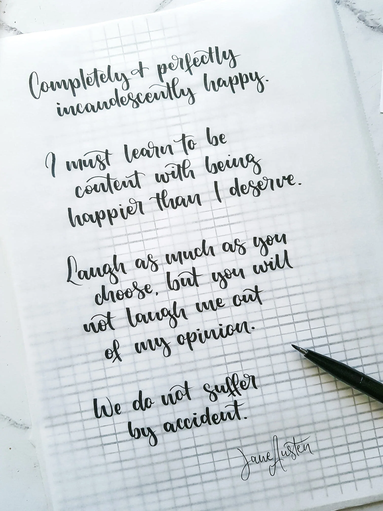
Any pen or material will do, below I’ve used my favourite, the Pentel Touch, or you can use any brush pen, watercolour, ink, rollerball, biro or pencil.
But if you’re digitally inclined, you can load your guide sheets onto some form of tablet, stylus product with a program like Procreate and letter there.
Lettering with Baking Paper

Lettering with 80gsm Reflex Printer Paper
INCLINE VS UPRIGHT
If lettering upright, ensure your straight strokes and letters run parallel with the vertical lines. If lettering at an inline, make sure your letters run parallel with the lines that are angled. Personally I follow these lines with my peripherals with a soft focus, a lot like the magic eye book!
You’ll probably find you’ll always use the incline guide sheets as lettering on an angle is tricky. But the upright guide sheets are great if you like to letter with the paper at an angle to your body, thus making those ‘straight’ lines not very straight.
Here’s another little comparison

Note how the brush strokes and entire letters run parallel with the lines

Like the upright lettering but the same principle applies to incline lettering
INCREASE IN DIFFICULTY
You may notice that the guide sheets you see in this post are much simpler then others. This is because over the years I have noticed that my style prospers with minimal guidelines, so that I have the creativity to ‘play’ or freestyle with the letters. It’s not hard to find more intricate guide sheets through a quick Google search, but if you do, here’s a visual with the same alphabet as before to show you how it works.

A FINAL NOTE
For practicing with the intent to increase skill and pen control, do try and stick to or within the lines as much as possible when practicing. So that when you do and you’re a rule breaker like me, you’ll find yourself being in control of some gorgeous pieces.
So how’s that? Do you have any questions or any tricks that you’d like to share? Let me know in the comments and I’ll reply xx