
The Rope Bridge + Free Lettering Activity
The rope bridge is an analogy I use to remind myself of how important it is to live a multi-faceted life rich in the motives & drives that are authentic to you.
The rope bridge is an analogy I use to remind myself of how important it is to live a multi-faceted life rich in the motives & drives that are authentic to you.

To build a bridge from scratch you need to spin your rope. You use a variety of materials or maybe just the one, but all have to be quality & blended to be strong to hold under pressure. The finished rope is then weaved to build a bridge to carry you from one spot to another.
The materials you use to spin the rope are the elements & things you value & don't value yet still contribute to your life. This is your career, side hustle, education, relationships, friendships, hobbies, values, goals, mental health, physical health & anything else you hold dear & live for. Having plenty of strong materials, means that when one or more of these areas cracks under pressure, you still have areas of your life to draw strength from & hold yourself together.

Bridges keep us safe from danger lizards in horrific remakes of classic movies
In practice, if you choose to go all in on your career, your career 'fibers' strengthen with you but threaten your other materials to be sacrificed, weakened or lost. So if your career then suffers for whatever reason, your career fibers frays & tears and your bridge’s now principle material, career, is lost!
Your bridge is tested as it bows that you'll either have to mend or rebuild if it comes crashing down.
Don’t be this bridge, this is a bad bridge.
Naturally life is dynamic & the materials can change at their own will. But I love to use the rope to remind me that building my life strengthens my the fibers in my bridge. If your values & drives are truly aligned with you, your life & fibers will enrich and strengthen each other so I can be ready for myself and others.
TL; DR having more in your life so you're not solely dependant on that one thing keeps you strong when life inevitably cracks or comes crashing down .
Activity
So to tie this in with lettering, at the bottom of the page is a printable activity:
Think through whatever values, goals, lifestyle routines you have. To get you started I’ve included some in the activity & mine below.
I’ve drawn the outline of a climbing knot, you just need to trace over the top with another piece of paper and letter your values, goals, lifestyle or anything else that comes to mind.
While I was making mine, I noticed that the balancing act of lettering & thinking introspectively allowed me to go off script to add all sort of things I wasn’t expecting.
Here’re mine:
My Core Values - Openness, Honesty, Movement, Time, People, Health, & Conflict
My social circles - Friends, Family, Wotso,
Movement & Hobbies - Climbing, running, my Instax camera, outdoors, music, & overusing the ampersand (this thing >&<).
Health - whole food plant based sprinkled with a good late night kebab or burrito, journalling, lettering, touching base with my psychologist.
Lifestyle, habits & routine - early morning runs and fitness, working on my business, my psychology studies, chilling with friends & family.
Gin induced dancing & the complete nonsense that makes life worth living.
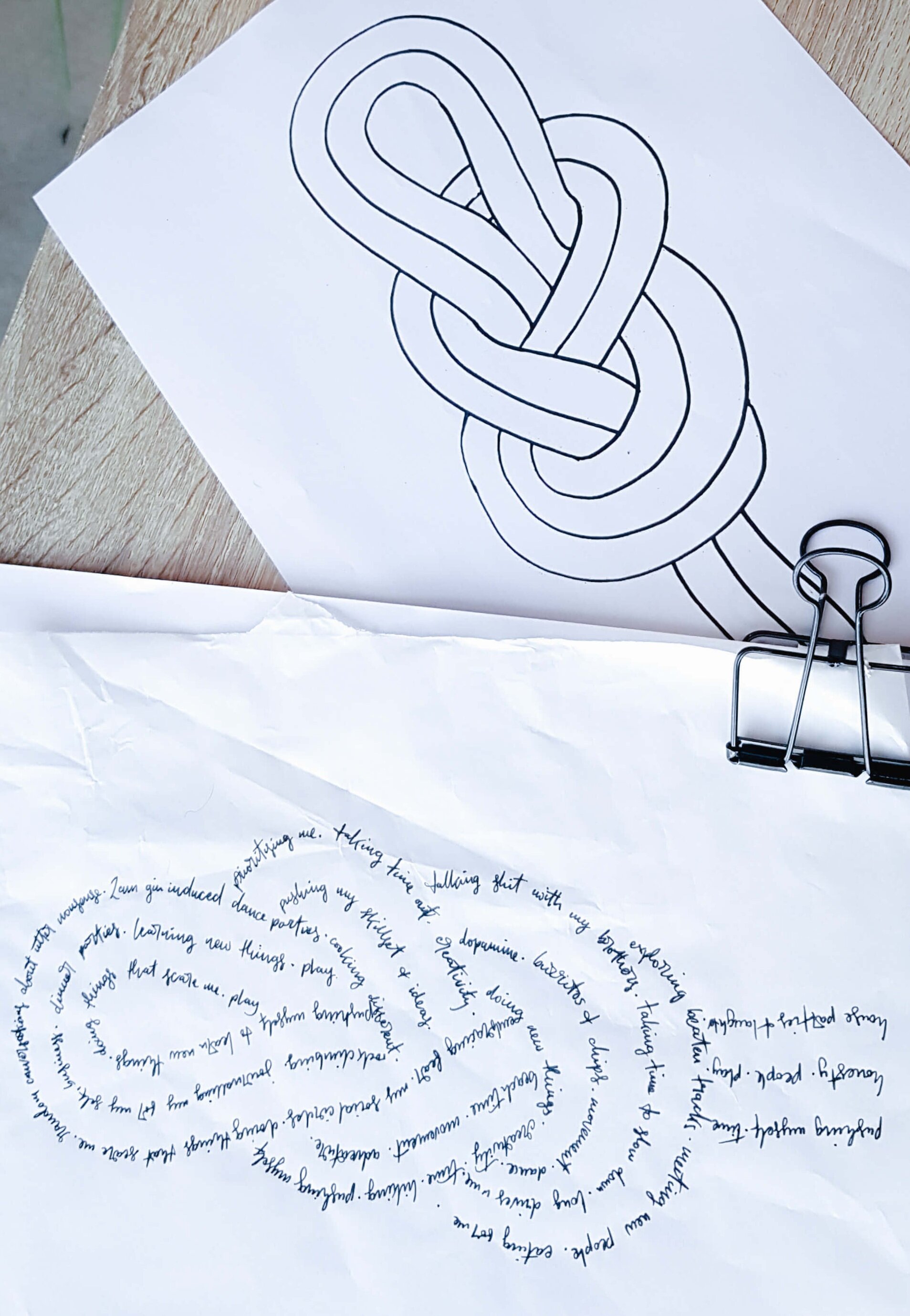
Voila! A double loop figure 8 knot, or spaghetti
What did you think?
Drop your questions or thoughts in the comments below!

To the most iconic bridge ever, Bridget Jones - Cheers Bridge!

Tools for Brush Lettering
A run through on the basic tools & supplies you need for brush lettering in Australia
A run through on the basic tools & supplies you need for brush lettering in Australia

BRUSH PEN
A brush pen is a pen that emulates a brush, but vary in a number of ways:
NIB SIZE - The wider the nib at the base means the thicker the stroke when you press fully. This means higher contrast with your thin strokes, and your lettering will much larger and require more paper space. The sharper the tip of the nib means thinner lines on your light strokes. Technically you can achieve those light thin strokes on all brush pens, but it's easier when the nib returns back to its intended original shape.
NIB FLEXIBILITY - A firm nib means it's harder to press down and get those thick strokes then it is on a softer nib. When starting it's better to work with pens with a firmer flex as the extra resistance makes it easier to control and maintain consistent pressure. Most pens just come with the one level of flex, but some like the Tombow Fudenosuke come in a variety of flexibility.
NIB MATERIAL - Brush nibs either come with bristles like a brush or with a felt tip.
When I want the bristle, brush effect I tend to just opt for an actual brush with ink, but when I do I usually go for popular options the Aquash Water brushes, Pentel Colour Brush Pens or Pentel Pocket Brush.
With the felt tips, my fave is the Pentel Sign Brush Pen. And to be honest I'm not 100% sure if it is completely made of felt, although I think it is but the nib is just so much smaller. But either way I prefer these nibs in pens like the Pentel brush and the Tombow Fudenosuke because it does not fray like the nibs in the Tombow Dual Brush pen, Ecoline Liquid Watercolour Brush Pen or Faber Castell's PITT brush pen.
INK CAPACITY - How fast you work through those pens depends on a number of factors. The size of your nib and pen is first, larger pens usually run out incredibly quickly because the nib needs that much more ink to function.
You can replace or replenish ink cartridges in some pens, although you may have to pay a little bit more. Check out this selection on Jet Pens for a good round up of all pens. You can buy some of these in Australia like the Pentel Colour Brush Pens, Pentel Pocket Brush Pen, or the Pilot Parallel Pen (although this is a broad nibbed pen).
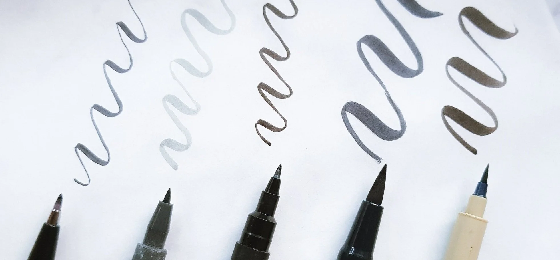
From left to right: Pentel Sign Brush Pen, Faber Castell PITT Brush Pen, Uni Pin Fineline Brush, Tombow Dual Brush Marker & Pigma Brush
PAPER
Most beginners start lettering on simple printer paper found lying about the house. Standard weight of printer paper is 80gsm and is thin enough to see thick black guidelines underneath and still hold its own.
In the past year or so I've switched to using rolls of baking paper to practice and create pieces on, as it's far cheaper and easier to purchase than tracing paper.
When creating keepsakes and lettering pieces to gift, I use watercolour paper of whatever thickness I prefer or need for the project. When lettering with pointed pen calligraphy, I will work with hot pressed paper as it has a smoother finish with less 'teeth' on the paper. For other lettering tools like brushes, brush pens or mixed mediums I will use cold pressed paper to get that watercolour paper texture. The term 'hot' and 'cold' comes from the method of how the paper is made. To help remember, think of hot pressed paper as smoother because someone ironed out the creases.
The porosity of your medium, or how much your chosen surface soaks up your ink, for example printer paper soaks up more than tracing or baking paper. You can tell this usually by how smooth your paper is and wet like your work looks like. Just be wary as the ink will take longer to dry so it will be easier to smudge. Other smoother paper options include Rhodia or Clairefontaine (my favourite) that you can get from Officeworks.
Tip: GSM means 'grams per square meter' and tells you the weight of the paper, or in other words the thickness of a piece. To help some approximate gsm paper weights are,
Tracing paper, 40 gsm
Printer paper, 80 gsm
Greeting cards, 220-280 gsm
300+ gsm, luxury greeting cards and invitations

Baking paper on the left, Printer paper on the right and watercolour paper on the bottom
PENCIL
I tend to use a HB very lightly pencils to sketch layouts and compositions, and to keep and correct lines and strokes in my pieces. The difference between pencils like 2B, HB and 2H etc is the density of the granite within the pencil.
ERASER
I use any clean, white eraser to remove any lines. Be extra careful when erasing on baking paper! The thinner paper makes it much easier to crinkle and rip when erasing. When you do, try to erase from the centre of the paper to the edges in one direction. There's nothing worse than creating an amazing piece and ripping it *cries
RULER
My rulers are either 15cm for smaller work, or 40cm for larger pieces. A clear good ruler helps me see through to help draw those clear lines relative to other lines. I used to be a big fan of the rolling ruler but have since moved on out of personal preference.
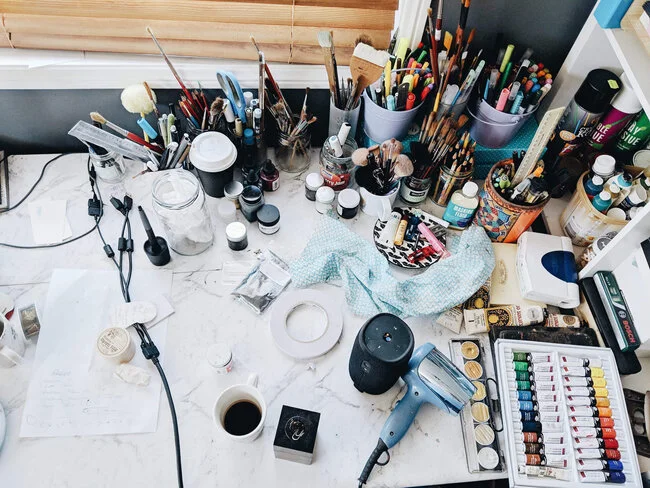
Making sense of it all. Photo by Lecinda Ward Photography
GUIDE SHEETS
Guide sheets are to keep your lines and word heights in check. Being a graphic designer, I was able to create my own that work to my style. You can get them for free in my shop, and check out my blog post to see how to use them.
LEARNING MATERIALS
Like starting any creative endeavor or learning a new skill, start small to progress and commit for a longer period of time. Using the tools mentioned here, you want to start with the basic strokes, then move to creating letters, words and then layout and composition. Of course rules are made to be broken but it’s good to get the foundations down pat first and that’s my recommendation.
To get started you can get the the beginning of my workshop by popping in your email below in the footer. But other great learning lettering resources that I have used include:
Online Courses - Skillshare, YouTube, Creative Live
Other Letterers - Lauren Hom, Ian Barnard, Gemma O Brien,
Meet Ups & Communities - Brisbane Hand Lettering Meetup, The Futur, Typism, Lettering Daily
QUESTIONS?
Let me know in the comments below if there’s anything you’d like me to touch on!

How To Use Guide Sheets
Making sense of guide sheets to up your lettering
Lettering guide sheets are lined templates help you maintain consistency in the length and angle of your strokes, and allow you to write longer passages with wider columns. All letterers use guides of some kind at some point in their process! It saves time and stress when creating piece, or hone in and practice those cleaner lines.
FYI the Guide Sheets you see in this post are one’s that I personally designed to cater for my style. You can download them for free from my shop here.
MATERIALS
You can write directly onto the guide sheets, but my personal preference is to write on a secondary piece of paper that rests on top of the guide sheet.
Printer paper will do but my favourite is torn off sheets from rolls of baking paper. Baking paper is cheaper, smoother and enables you to see the lines so much better as you can see by my little comparison below. Plus because the baking paper is so smooth or less porous, the pen ink and nib lasts longer since less of the ink sinks in, and there’s friction to wear the nib down. And to hold the sheets together quickly and easily, I use either these little or big bulldog clips.
Any pen or material will do, below I’ve used my favourite, the Pentel Touch, or you can use any brush pen, watercolour, ink, rollerball, biro or pencil.
But if you’re digitally inclined, you can load your guide sheets onto some form of tablet, stylus product with a program like Procreate and letter there.
Lettering with Baking Paper

Lettering with 80gsm Reflex Printer Paper
INCLINE VS UPRIGHT
If lettering upright, ensure your straight strokes and letters run parallel with the vertical lines. If lettering at an inline, make sure your letters run parallel with the lines that are angled. Personally I follow these lines with my peripherals with a soft focus, a lot like the magic eye book!
You’ll probably find you’ll always use the incline guide sheets as lettering on an angle is tricky. But the upright guide sheets are great if you like to letter with the paper at an angle to your body, thus making those ‘straight’ lines not very straight.
Here’s another little comparison

Note how the brush strokes and entire letters run parallel with the lines

Like the upright lettering but the same principle applies to incline lettering
INCREASE IN DIFFICULTY
You may notice that the guide sheets you see in this post are much simpler then others. This is because over the years I have noticed that my style prospers with minimal guidelines, so that I have the creativity to ‘play’ or freestyle with the letters. It’s not hard to find more intricate guide sheets through a quick Google search, but if you do, here’s a visual with the same alphabet as before to show you how it works.

A FINAL NOTE
For practicing with the intent to increase skill and pen control, do try and stick to or within the lines as much as possible when practicing. So that when you do and you’re a rule breaker like me, you’ll find yourself being in control of some gorgeous pieces.
So how’s that? Do you have any questions or any tricks that you’d like to share? Let me know in the comments and I’ll reply xx